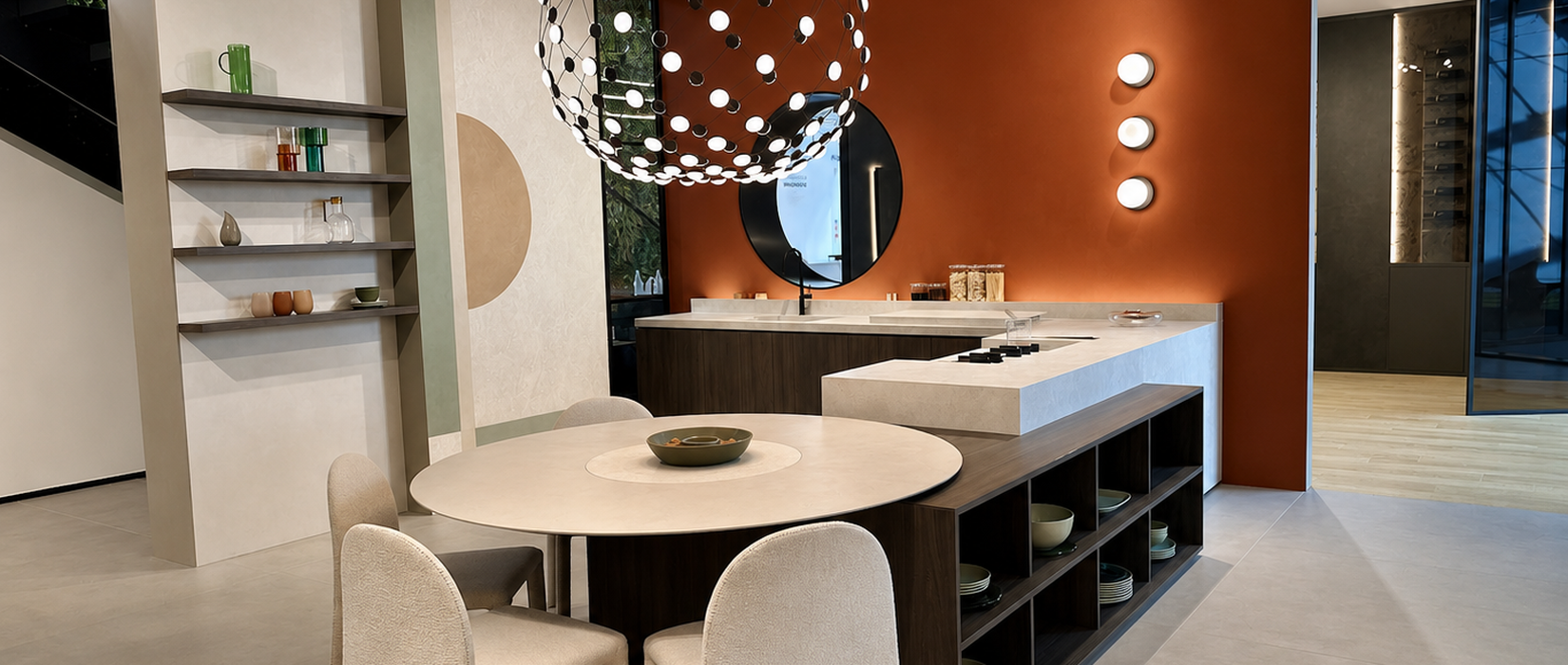
The choice of wall covering can profoundly change the look of a kitchen and the way it interacts with cabinets, countertops, and the surrounding spaces. The ability to coordinate vertical and horizontal surfaces also allows you to create continuity between walls, countertops, and other kitchen elements.
In some kitchens, a large marble-effect slab takes center stage, while in others, it’s the rhythm of a brick-patterned tile, the texture of a mosaic, or a textured surface that defines the room’s character.
But there’s also a practical aspect to consider: the walls behind the stove and sink must withstand splashes, stains, and frequent cleaning, while countertops and horizontal work surfaces are subjected to intense daily use, which requires surfaces with appropriate technical characteristics. For this reason, size, material, and finish should be chosen with both the aesthetic result and daily use in mind.
So how do you choose the most suitable wall covering for your kitchen?
The size, material, color, and finish can transform the outcome of your design.
A large slab creates continuity and allows the surface pattern to stand out, offering the possibility of extending the same textural effect from the backsplash to the countertop, creating a visual connection between vertical and horizontal surfaces. A three-dimensional tile adds depth, while a small-format tile or mosaic can add character even to a limited section of the wall.
And the possibilities don’t stop there: ceramic surfaces can become part of a broader design concept, encompassing counters, countertops, kitchen islands, tables, sinks, cabinet doors, and shelves—all custom-made.
1. Large Slabs: Continuity and Material Combinations
Large slabs create a sense of continuity across surfaces, reducing the number of joints and allowing the material’s natural pattern to take center stage.
Whether you choose a marble-effect finish with bold veins, a stone with natural hues, or a metal-effect surface, the large format highlights the material’s visual appeal and creates wall coverings with a strong visual impact.
The result is particularly evident in the so-called “backsplash”—the wall between the countertop and the upper cabinets—where a continuous surface can visually connect the different parts of the kitchen.
The continuity of large slabs also offers a practical advantage: fewer grout lines mean fewer places where dirt and residue can accumulate, a particularly useful feature in work areas.
But the design possibilities of large slabs extend beyond their size; their surface can serve as the starting point for creating combinations capable of completely transforming the character of the kitchen.
A stone with natural hues can complement the warmth of wood; a marble with bold veining can enhance a central island; while resin and metal effects allow you to explore more minimalist or industrial styles.
The choice depends on the balance you wish to achieve between surfaces, furnishings, and colors: here, then, are some combinations to get you started.
.
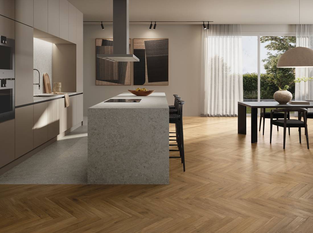
a) Pairing Wood-Effect and Stone-Effect Tiles
Wood introduces warm grain patterns and tones, while stone can provide a more neutral and textured base. To achieve a balanced result, it’s best to avoid having both effects share the same visual intensity. If the floor features a fairly prominent wood pattern, a stone with more delicate shades can complement it without creating visual competition. Conversely, a more dynamic stone-effect surface can be enhanced by uniform wood and furniture with simple lines.
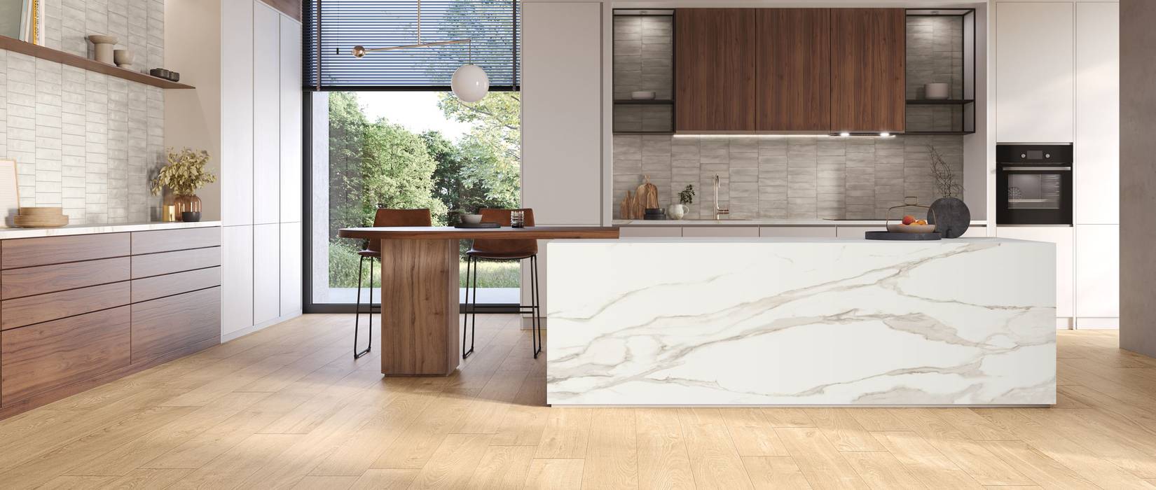
In the photo: the 4Ever and Cobb combination, where the wood-effect flooring meets the textural quality of stone, creating a coordinated space in which the surfaces retain their distinct characteristics.
.
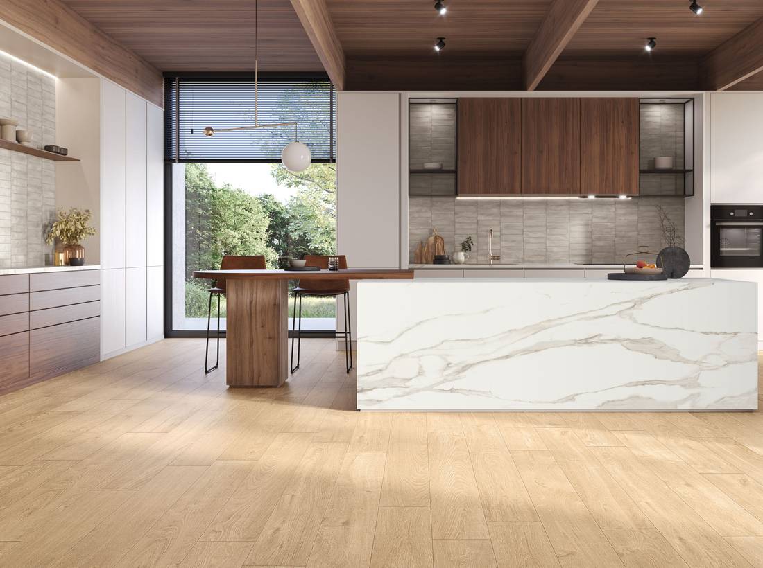
b) Combining Wood-Effect and Marble-Effect Slabs
The marble-effect finish, especially when it features prominent veining, can become the focal point of the design. In a kitchen with a central island, for example, a marble-effect surface can lend greater presence to the space, while wood on the floor or in the furnishings helps balance the overall look. We recommend also considering the color temperature of the veining: marble with warm undertones can harmonize with natural wood finishes, while cooler surfaces allow you to create contemporary contrasts.
Pictured: the combination of Purity of Marble and Gracy offers the opportunity to play on the contrast between the marble’s veining and the natural look of the wood-effect finish.
.
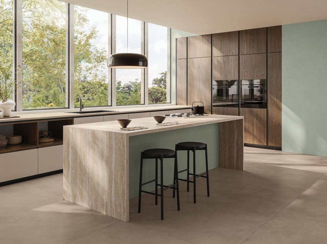
c) Combining Resin-Effect and Stone-Effect Slabs
When you prefer a more minimalist kitchen, the resin effect can serve as an interesting color base. Its uniform surfaces and subtle variations in tone allow it to complement materials with more striking patterns, such as natural stone reinterpreted in stoneware. In this case, we recommend choosing a cohesive color palette: colors that are close to one another can create a more seamless effect, while a sharper contrast draws greater attention to islands, countertops, and cabinetry.
Pictured: a combination of Colovers+ and Astrum. The resin-effect finish creates a uniform color base, while the travertine-effect surface highlights the island and adds more textural movement.
.
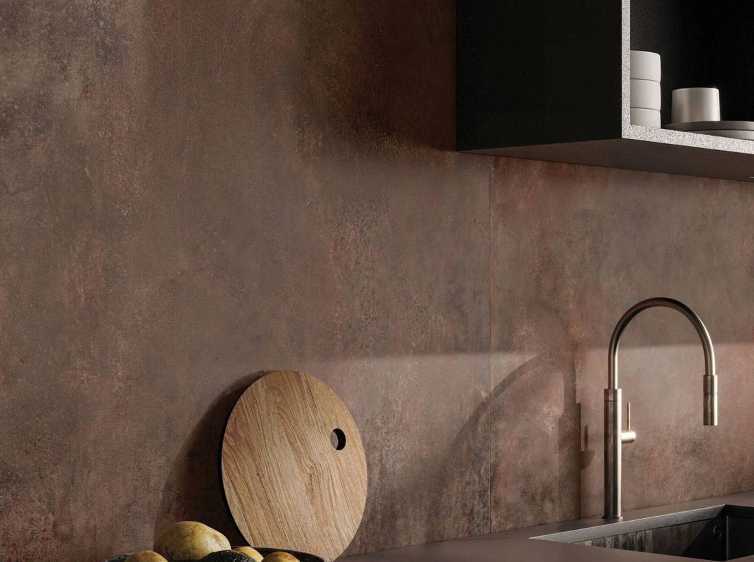
d) Metal-Effect Slabs
Metal-effect surfaces bring a bold, textured aesthetic to the kitchen, evoking an industrial style while also adapting to more minimalist and contemporary designs.
From the warm hues of oxidized metals to cooler, neutral tones, the various interpretations of metal allow you to create different atmospheres and play with contrasts and combinations.
Pictured: IRONY Corten.
2. Standard Formats: Playing with Surfaces, Textures, and Finishes
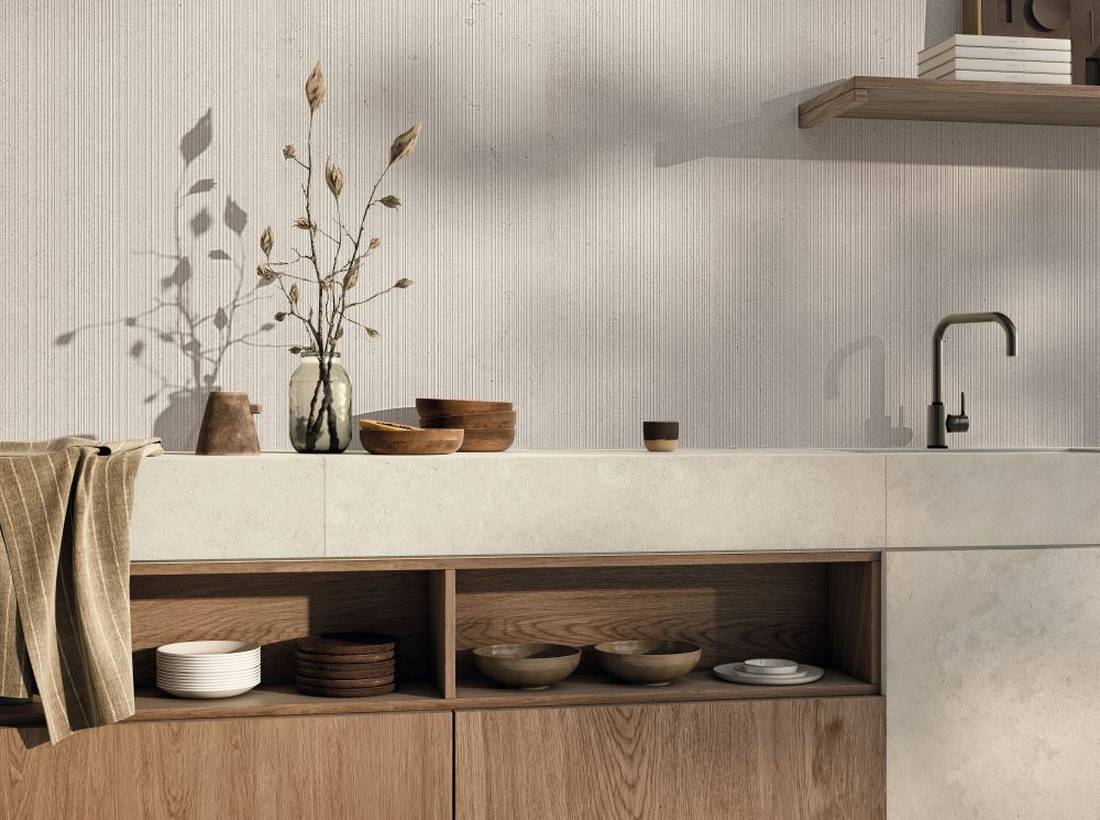
Alongside large slabs, standard ceramic tile sizes offer numerous possibilities for designing kitchen wall coverings, through colors, textural effects, finishes, and various installation solutions.
From stone-effect surfaces to wood-inspired finishes, all the way to the most contemporary interpretations of concrete and resin, this selection allows you to create combinations with floors, furniture, and countertops, maintaining visual continuity or introducing deliberate contrasts.
Another option is three-dimensional textures, which add depth and movement to walls without necessarily relying on particularly striking colors or patterns. A striped relief, a ribbed texture, or an alternation between smooth and textured surfaces can define a specific area of the kitchen.
Pictured: SILENT Juta 3D texture—the three-dimensional texture creates a vertical rhythm on the wall.
.
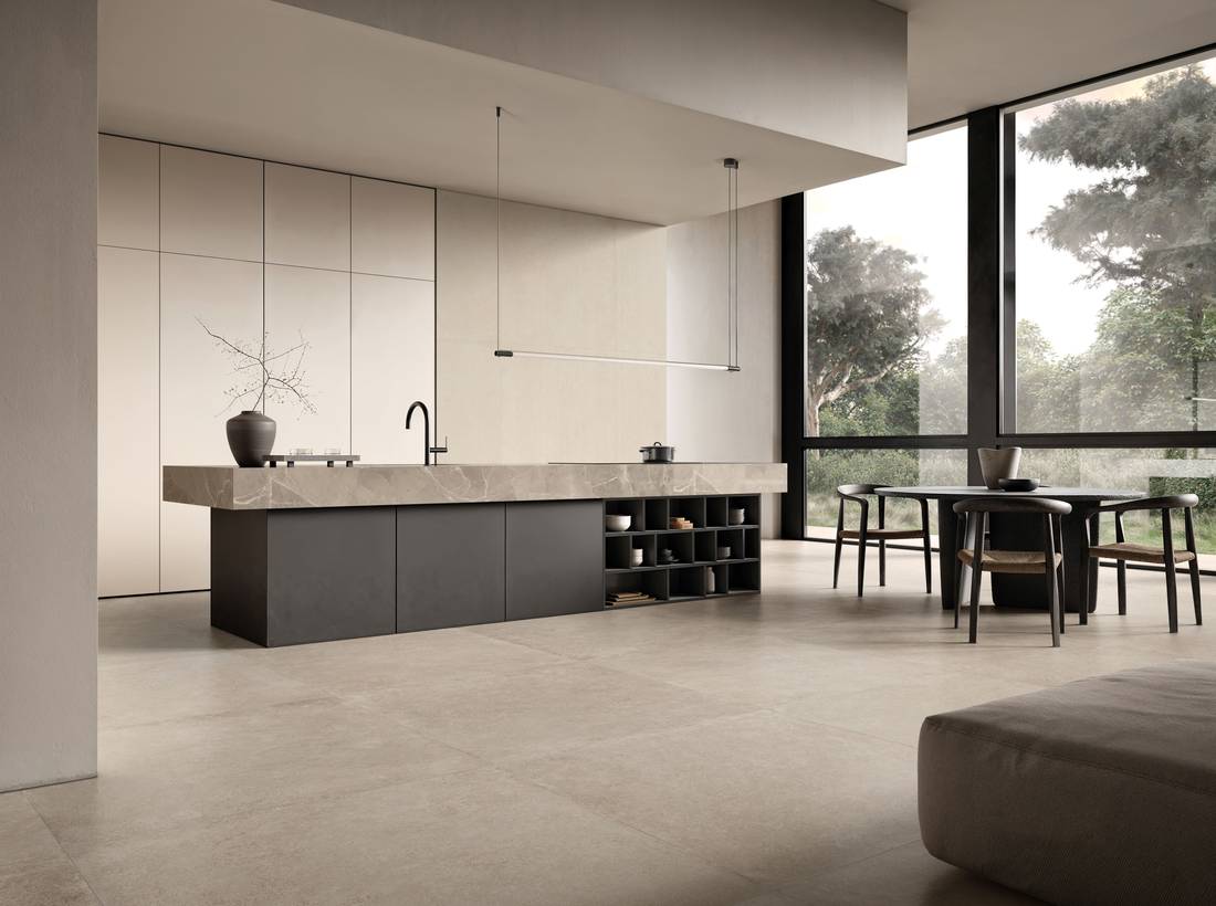
Our advice is to consider where to use these elements, choosing areas where they can be shown to their best advantage. A side wall, an architectural feature, or an element connecting to the living area can all become interesting focal points to work with.
Pictured: Inx Ivory, 3D Riga structure, and Purity of Marble Elegant Greige for the countertop cladding.
.
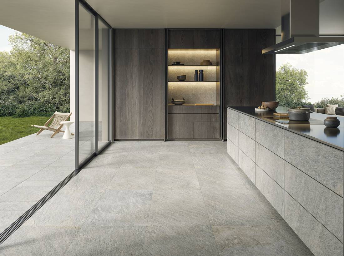
Standard sizes also allow you to explore applications that go beyond traditional floor and wall coverings. Ceramic surfaces can, in fact, be integrated into the design of the furnishings, creating a visual connection between the various elements of the kitchen.
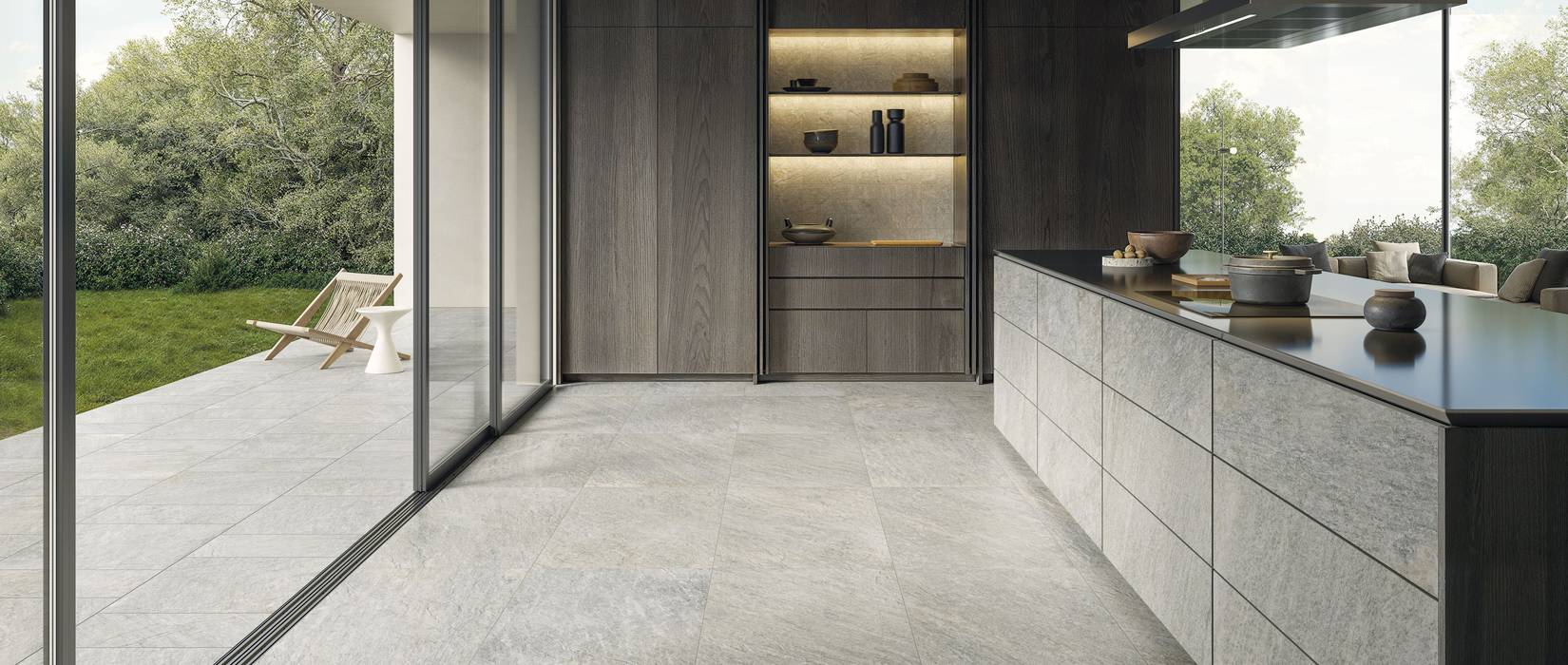
For example, in this kitchen, Menhir—one of our stone-effect collections—is used in the 60×120 cm size to clad the cabinet doors as well. The continuity of material between surfaces and furniture helps create a cohesive whole, in which the furnishings become an integral part of the design.
Pictured: MENHIR 60×120.
.
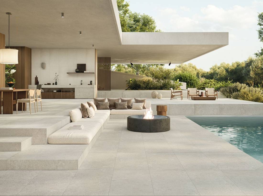
From the Indoor Kitchen to the Outdoor Space
When the kitchen opens directly onto a terrace or patio, the relationship between the indoor and outdoor spaces becomes an integral part of the design.
It’s not necessary to use a single finish everywhere. You can choose coordinated collections, maintaining consistent colors and materials while selecting technical finishes for the exterior that are suited to the conditions of use. This allows you to visually connect the spaces without compromising the specific requirements of floors, walls, and areas exposed to the elements.
Pictured: SILENT Juta T-20.
3. Brick-Style Tiling: How to Add Character to Your Backsplash
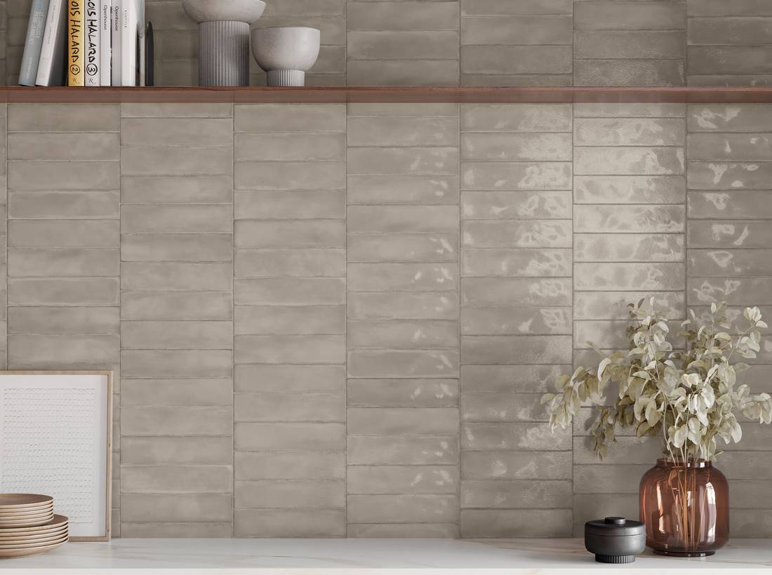
Small-format tiles can completely transform the character of a kitchen. Unlike large slabs, which emphasize continuity, brick-style tiling highlights the rhythm of the installation and adds a more graphic and decorative element.
This makes it particularly well-suited for the backsplash, where it can serve as a distinctive feature without necessarily covering an entire wall.
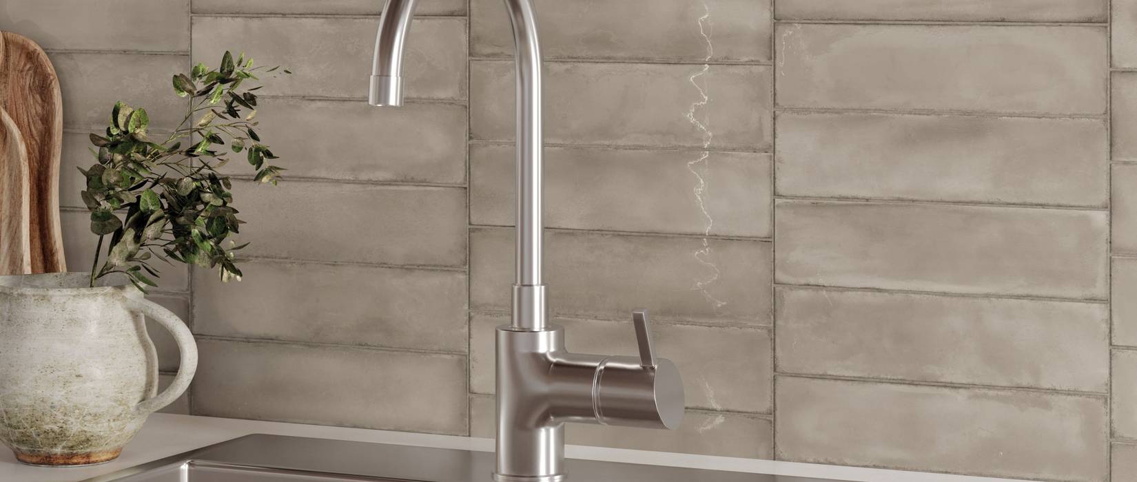
Among Supergres’ solutions, Bricksy reinterprets the classic brick in a 6×24 cm format, with a color palette designed to create tone-on-tone combinations or bolder contrasts.
Thus, a neutral shade can complement minimalist kitchens and natural materials.
In the photo: Bricksy Dove, where the brick in a neutral shade creates rhythm on the backsplash.
.
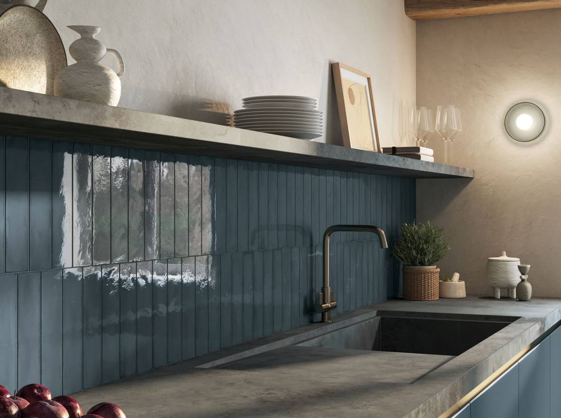
A bold color can create a contrast with furniture and countertops.
Pictured: Bricksy Ocean.
.
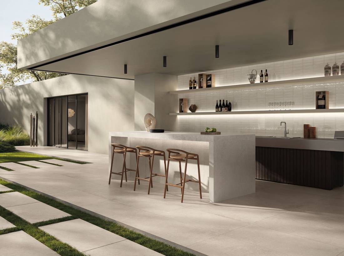
The glossy finish creates reflections and variations that change with the lighting, while a natural surface offers a subtle effect.
Pictured: Bricksy Talc.
.
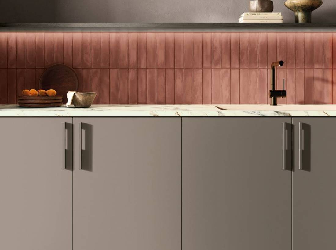
The direction of the bricklaying also matters: horizontally laid bricks emphasize the width of the wall; vertical laying, on the other hand, can highlight the height of the wall or add rhythm to a smaller section.
Pictured: Bricksy Marsala—the warm hue of the brick introduces color to the backsplash and complements the project’s more neutral surfaces.
Our advice is to always consider the relationship between the bricks, grout, and furnishings. If the wall covering already features a bold color or a highly textured surface, simpler furniture and countertops can help maintain visual balance.
4. Mosaics: Working on the Texture and Details of the Covering
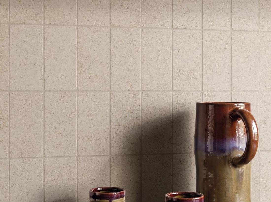
While bricks use the repetition of a single pattern to create rhythm, mosaics allow for a more intricate and detailed design. Small elements, different geometric shapes, and variations in surface texture create a pattern that can add depth even to a very simple wall.
In the kitchen, mosaic tiles can be used to cover the area behind the countertop, accent a shelf, or highlight a section of the wall. You don’t necessarily need to choose bold colors. A tone-on-tone mosaic can introduce movement while maintaining a minimalist look.
Among Supergres’ offerings, the Silent, Lightstones, Whisper, and Kave collections feature mosaic tiles with various geometric shapes and textures that complement their respective coordinating surfaces.
Pictured: Silent, Burattato mosaic—a fine, textured pattern characterizes the kitchen wall covering while maintaining a natural and understated color palette.
.
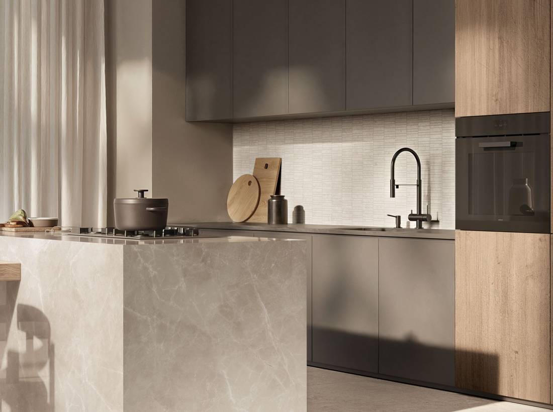
Pictured: Lightstones, Tumbled mosaic—this mosaic adds a delicate texture to the work area, blending seamlessly with the limestone-effect surfaces.
A textured finish or a slightly irregular edge can give the surface a more natural look.
.
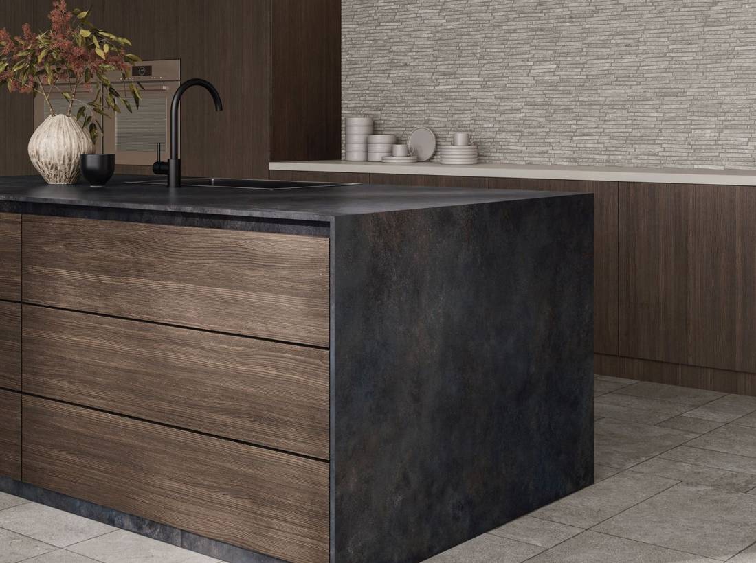
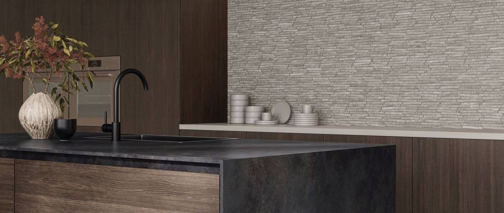
Elongated geometric shapes or more regular patterns, on the other hand, create a contemporary and orderly look.
Pictured: Whisper, Stick mosaic, the mosaic’s elongated shape creates movement on the wall and complements the kitchen’s coordinating surfaces.
.
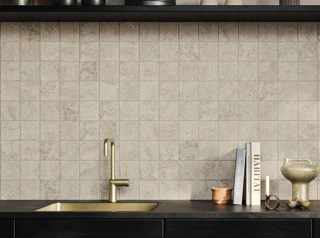
In the photo: Kave, Ten mosaic.
Our recommendation is to consider how the mosaic’s pattern relates to the other elements in the kitchen.
A highly textured surface works well alongside more linear furnishings, while a subtle mosaic can enhance even a design that already features veining or textural effects.
5. Custom Work: Integrating Finishes, Furniture, and Spaces
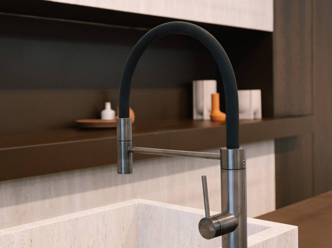
In the kitchen, ceramic surfaces can go beyond traditional wall coverings.
In a meticulously designed project, they can also be used to clad structural elements, create sinks and countertops, cabinet doors, shelves, and other furnishings such as tables, establishing a closer relationship between architecture and furniture.
This is where custom fabrication opens up interesting possibilities.
An island can become a structure with a continuous design; a countertop or vertical cladding can feature the same material; cabinet doors can be coordinated with the rest of the surfaces; while shelves and architectural details can blend seamlessly into the overall composition.
The design advantage lies in the ability to choose where to maintain continuity and where to introduce variation.
A kitchen featuring a stone-effect surface, for example, can use the same material language for certain furnishings, avoiding the addition of visually incongruous materials.
Among our solutions, collections such as Purity of Marble, Astrum, Colovers+, and Kave allow you to explore coordinated designs and custom work, using ceramic surfaces that are also applied to furnishings and architectural elements.
Pictured: sink and shelves made with Astrum, travertine-effect.
.
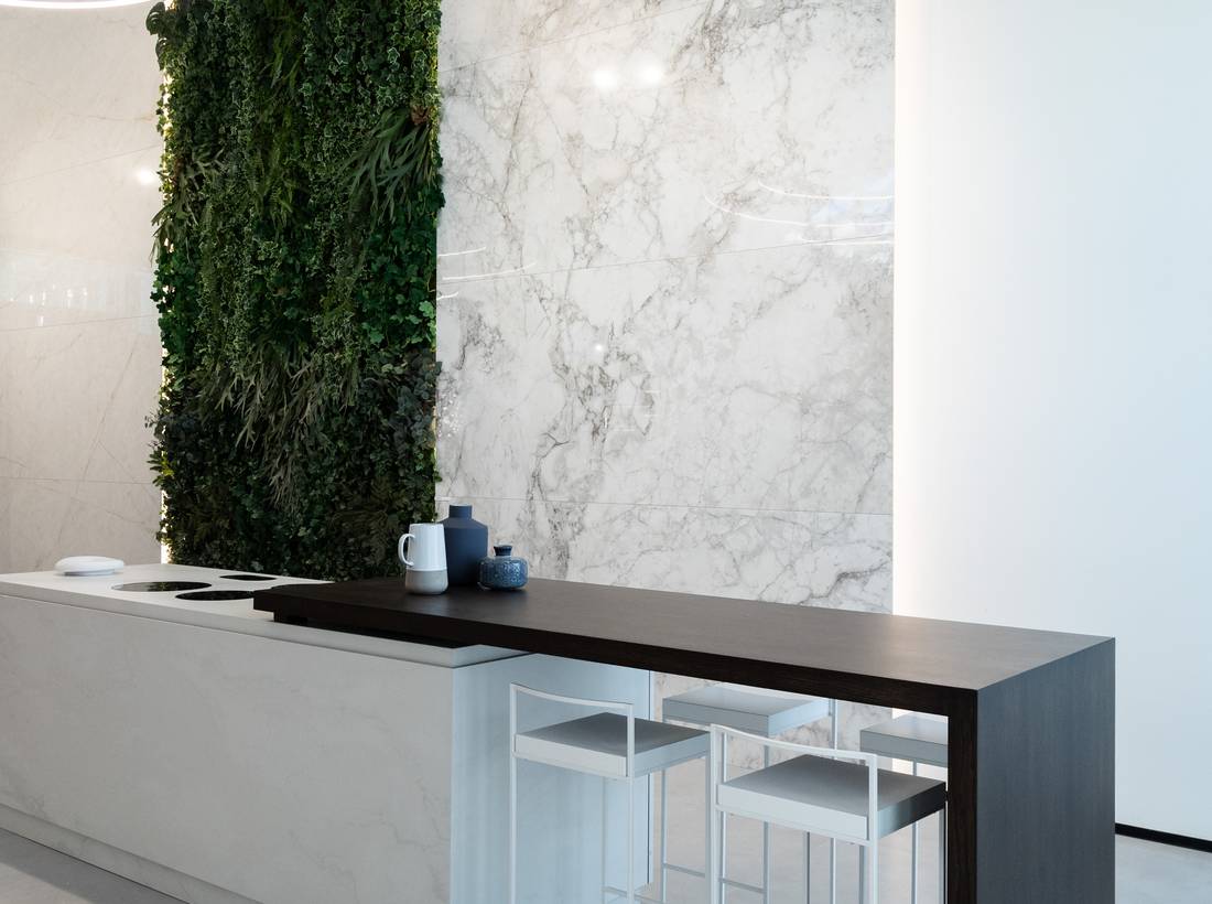
A different finish or a more pronounced grain, on the other hand, can give the island or a specific piece a more striking presence.
In the photo: Purity of Marble, Pure White—the island’s cladding and coordinating elements create a minimalist ensemble, in which the ceramic surface contributes to the design of the furnishings.
.
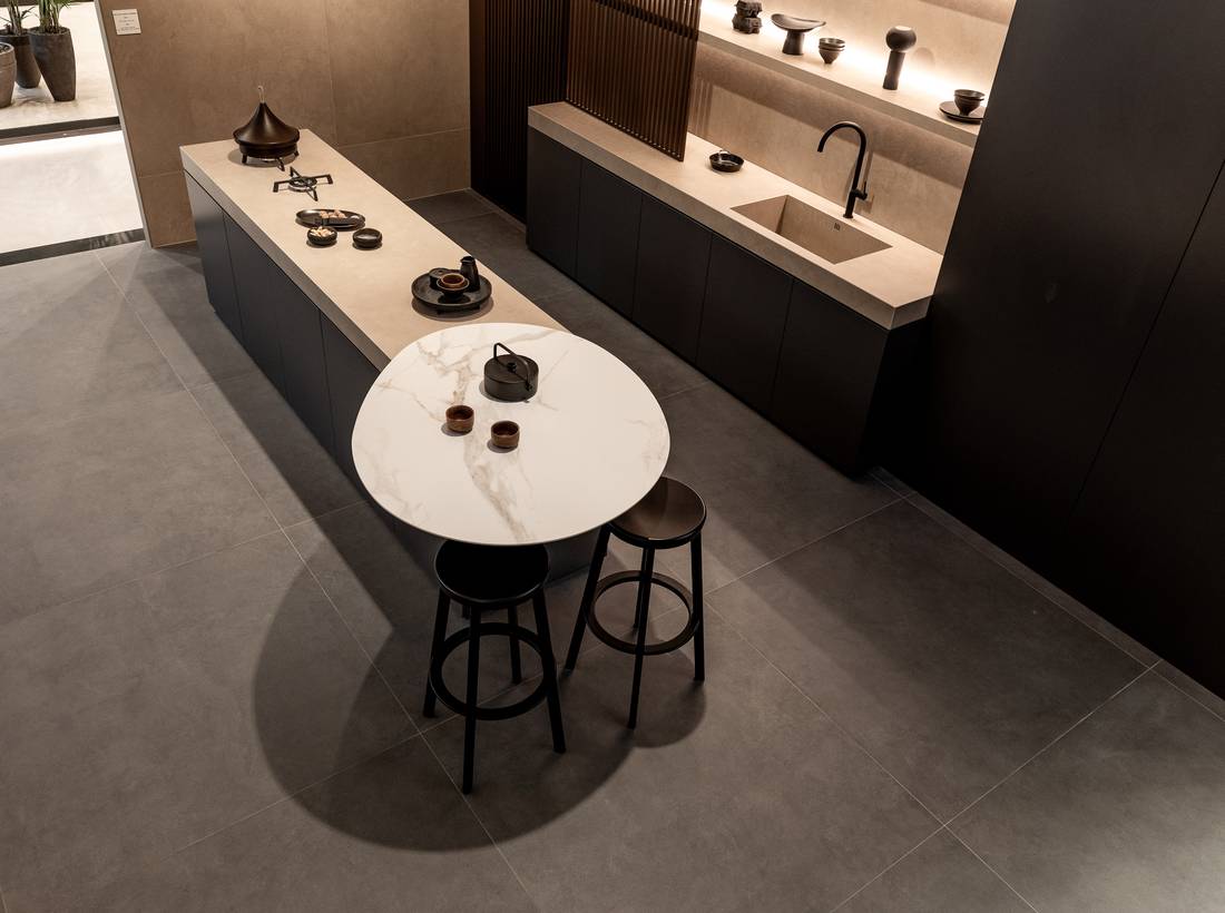
Pictured: Colovers+ and Kave—a custom kitchen design in which textured surfaces and coordinating colors complement the design of the island and the furnishings.
.
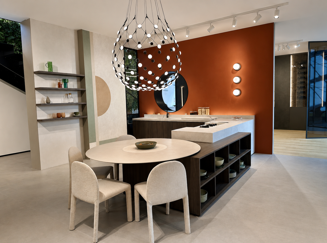
A concrete example of the possibilities offered by custom design is this kitchen, where surfaces, furnishings, and countertops have been designed to complement one another.
The island countertop, the sink area countertop, and the round side table combine different forms and functions within the same design. The horizontal surfaces coordinate with the wall tiles and the dimensions of the cabinetry, creating visual continuity even through the use of different materials and finishes.
Pictured: Rayclay and Purity of Marble—the central island, the countertops, and the round side table demonstrate how custom work allows for the integration of ceramic surfaces and furniture elements into a coordinated composition.
In all these cases, it is important to design each element in relation to its function: dimensions, thicknesses, cuts, edges, supports, and intended use must be evaluated to identify the most technically suitable solution.
.
A kitchen designed to be lived in
The choice of cladding depends on the role we want the surfaces to play.
Large slabs catch the eye and create a dramatic effect, highlighting continuity and material combinations. Standard sizes and three-dimensional textures introduce variations in texture and depth. Brick-style tiles and mosaics offer different ways to personalize walls, while custom designs allow you to extend the design to furniture pieces.
Every choice, however, must also account for the kitchen’s daily use: cleaning, durability, resistance to water and heat, and food preparation activities. This is why porcelain stoneware is the ideal solution, as it offers durable, hygienic, and easy-to-maintain surfaces, with a wide variety of effects, sizes, and finishes.
The best results are achieved when wall tiles, flooring, countertops, and furnishings are designed together, with equal attention paid to both aesthetics and practicality.
Discover the Supergres collections for the kitchen and the possibilities offered by large slabs
 Look on the map