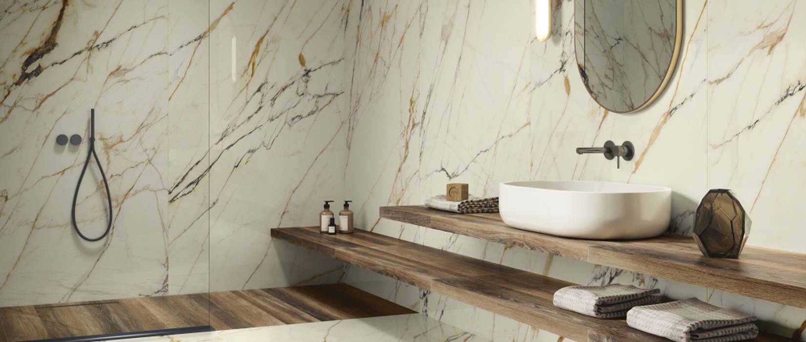
The bathroom is one of the most complex rooms to design, because it combines functional, technical, and aesthetic needs in a space used every day.
The shower, tub, sink, walls, floors, niches, furnishings, and walkways must all work together coherently. For this reason, surfaces serve more than just a decorative function: they help define the perception of space, the way different areas are interpreted, and the overall atmosphere of the room.
Choosing bathroom tiles, therefore, isn’t just about deciding between a marble or stone look, light or dark shades, or large or small formats—it’s about understanding the role each surface will play.
Some will serve to create continuity, while others will help reduce visual disruptions.
Still others will introduce color, depth, rhythm, or a specific focal point.
With this in mind, porcelain stoneware, large slabs, and white-body wall tiles become distinct design tools to be selected and combined based on the desired effect.
Here are 6 design choices that can change the way we perceive and experience the bathroom space.
1. A total look with stoneware to create a cohesive space
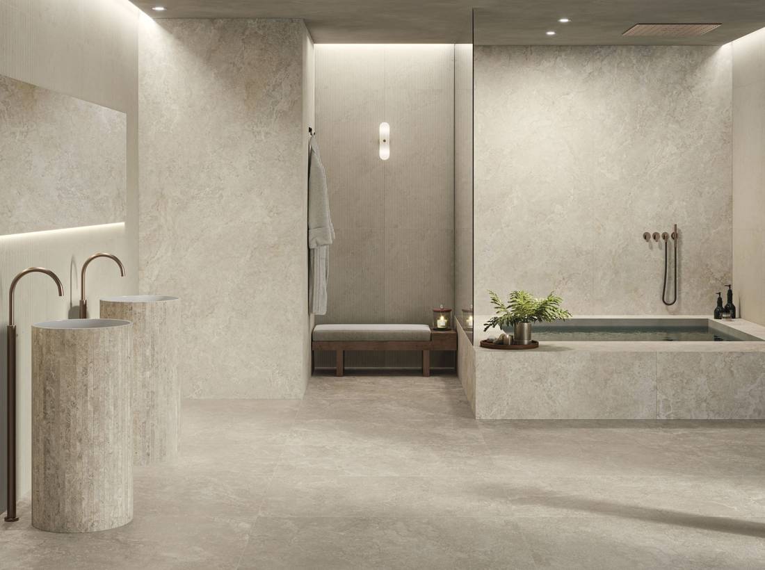
One of the most common goals in bathroom design is to create a harmonious, orderly, and cohesive space, ensuring that the floors, walls, and details don’t appear to be separate choices.
The “total look” concept addresses this very need: the floor, walls, shower, tub, and vanity area are designed as parts of a single visual system.
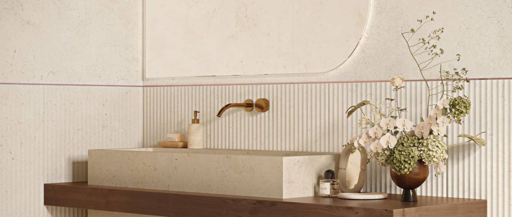
Pictured: KAVE, featuring a 3D Plissé design in the vanity area; the tub and sinks are finished in the same color.
.
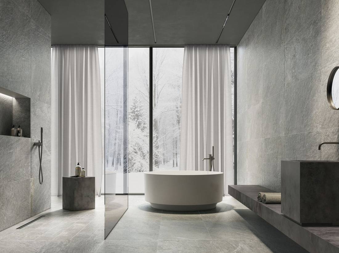
This doesn’t mean making everything the same, but rather creating continuity through surfaces that share the same material, color, or atmosphere, introducing variations only where needed: a three-dimensional structure in the sink area, a mosaic in the shower, a change in texture on a wall, or a feature treated with the same color as the wall tiles.
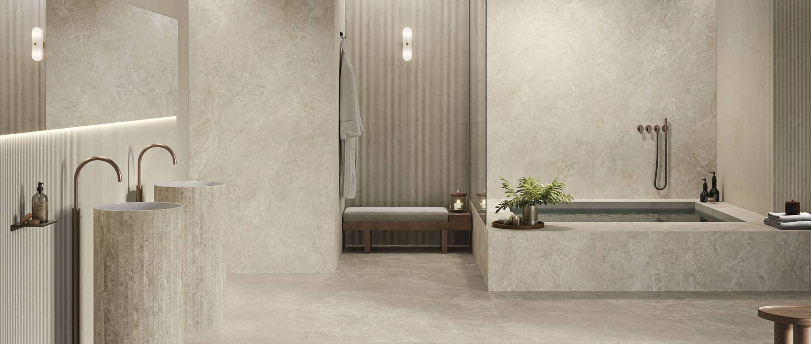
Pictured: MENHIR Grey, a bathroom featuring a total-look stone-effect porcelain tile design with porcelain tile fixtures.
In this way, the space remains cohesive without feeling flat. Porcelain stoneware is particularly well-suited to this type of project because it allows for coordinated flooring, wall tiles, and built-in elements, maintaining aesthetic continuity and performance suitable for everyday bathroom use. The recommendation, therefore, is to start with a common base and choose a single approach to variation: the same material with different textures, the same color with different sizes, or coordinated surfaces that distinguish functions without fragmenting the overall design. Among Supergres’ solutions, collections such as KAVE and MENHIR allow you to create bathrooms with a total-look stone-effect porcelain tile design, where the different zones remain recognizable yet are linked by a consistent material language.
2. Large slabs to minimize grout lines and visual interruptions
In the bathroom, grout lines have a significant impact on the perception of space.
When they are numerous or very prominent, they can disrupt the surface pattern. When they are minimal, however, walls and floors appear more fluid and continuous.
Large slabs allow for expansive, minimalist, and striking surfaces, which are particularly effective in showers, on full-height walls, and in projects where a more architectural effect is desired.
In the case of a marble-effect finish, visual continuity becomes even more important.
Vein matching—that is, aligning the veining patterns between one slab and another—makes the wall appear more visually continuous, reducing visual breaks between surfaces.
This choice can yield very different results.
A light-colored slab can make the bathroom brighter and more airy.
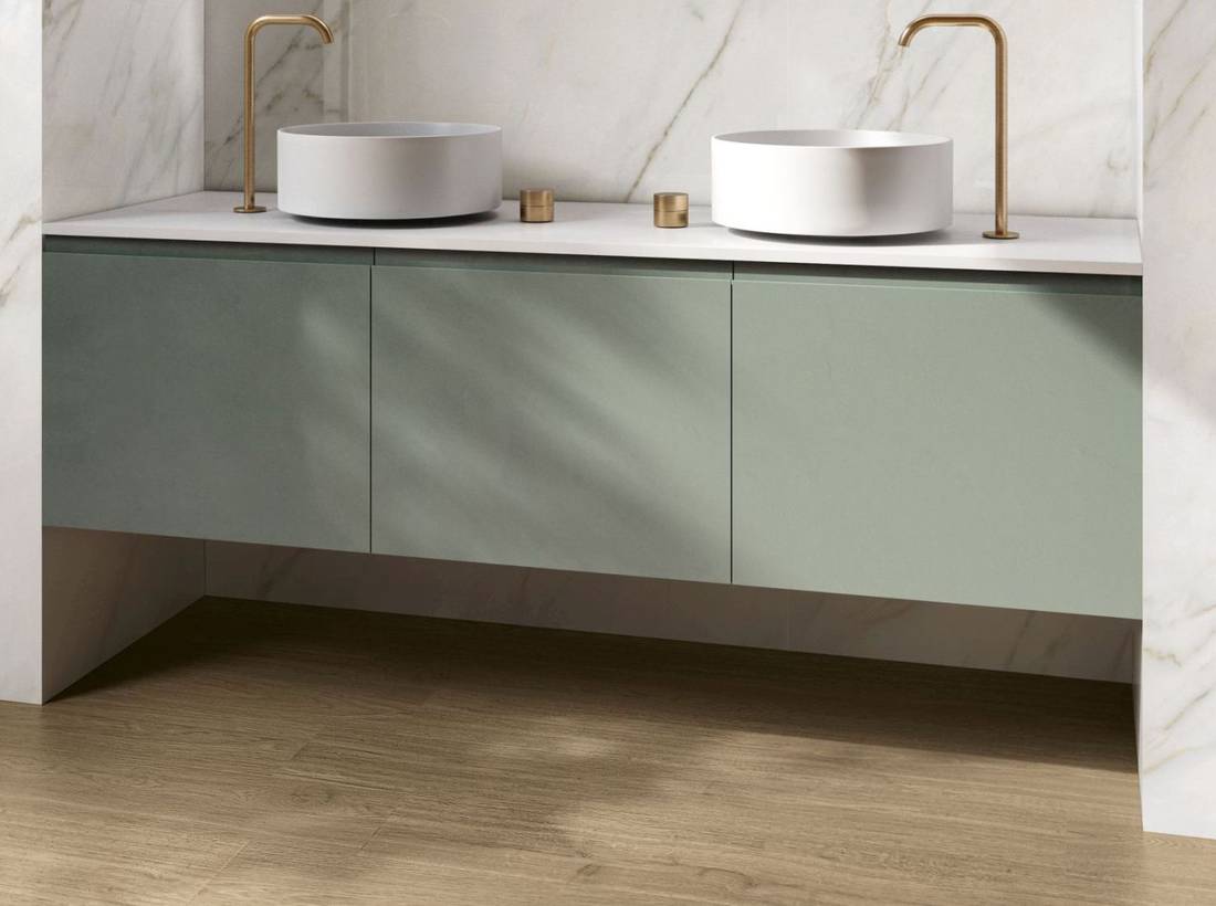
Pictured: Purity of Marble, Eden. A bright, seamless sink niche that is enhanced by its interplay with the green cabinet and wood-effect flooring.
.
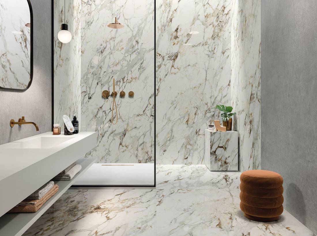
A pronounced vein pattern can transform a wall into the focal point of the design.
Pictured: Purity of Marble, Capraia. The marble-effect surface defines the shower area as the centerpiece of the design, while the more neutral side walls help to better highlight the space’s proportions, depth, and functions.
.
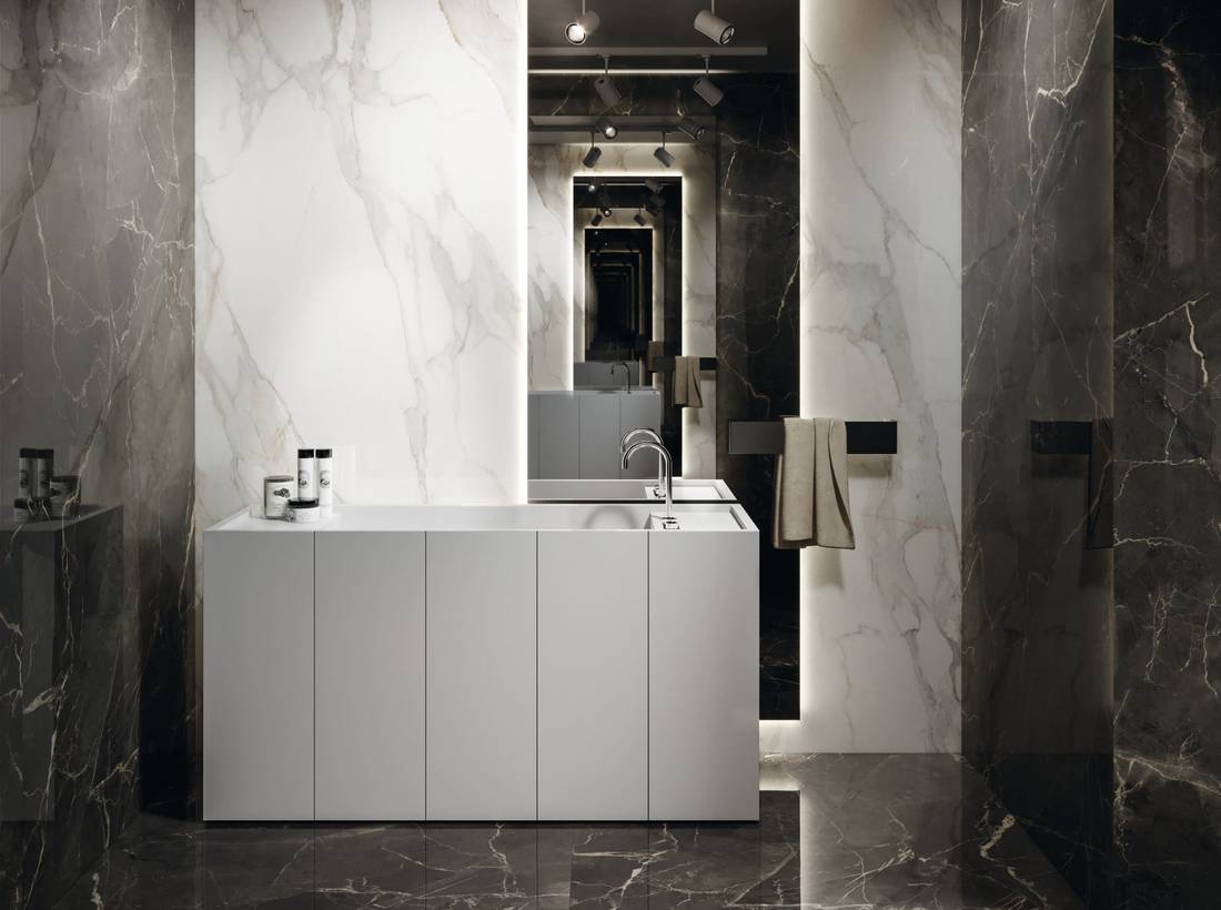
A black-and-white combination can create a more striking contrast, especially when the back wall is treated as the focal point and the side walls remain darker.
Pictured: Purity of Marble, Supreme Dark. The light-colored back wall serves as the focal point, while the side walls and floor provide a dark contrast.
.
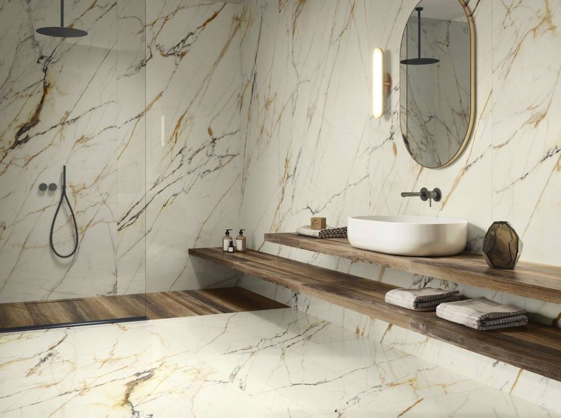
Incorporating another textural effect can also help make the overall look warmer and more natural. A wood-effect shower pan, for example, can tie in with the vanity area’s furnishings and create a softer interplay with the marble effect.
Pictured: Purity of Marble, Mysterous White. Minimal grout lines and vein matching for a seamless wall; a wood-effect shower pan that complements the vanity area’s fixtures.
Among Supergres’ solutions, PURITY of MARBLE allows you to work with large marble-effect slabs, minimal grout lines, and visual continuity, enhancing both “total look” designs and bathrooms built around bolder contrasts.
3. Create a focal point with contrast, decoration, or finish
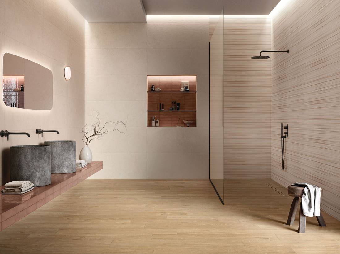
In a bathroom, not all surfaces need to draw attention in the same way.
The first step is to identify the focal point you want to highlight: the shower wall, the sink area, a niche, the bathtub, or the surface that’s visible upon entering.
Once chosen, the rest of the design should complement it.
The focal point can be created by a large marble-effect slab, a color contrast, a decorative pattern, a glossy finish, a “brick effect,” or a three-dimensional texture. The important thing is that it plays a clear role.
A niche clad in contrasting glossy brick can become the first thing you notice, and a sink wall accented with a darker color can add depth to the space.
Pictured: Inx Loto, Dune, Stripe Warm, Gracy Oak, and Bricksy Ocean.
.
The combination of solid colors and decorative patterns can create a symmetrical composition and guide the eye.
Pictured: Inx Agave, Jasmine, and Decoro Voile.
Or, as we saw in the previous point, a feature wall made of marble-effect slabs can take center stage thanks to the continuity of the veining.
Our advice is to choose just one focal point and let the other surfaces support it.
When too many elements vie for the spotlight, the bathroom loses its sense of hierarchy.
When, on the other hand, the focal point is clear, even different materials and finishes can coexist more naturally.
Among Supergres’ solutions, collections such as PURITY of MARBLE, YOUR MATCH, INX, and BRICKSY allow you to create different focal points using large slabs, decors, color, brick, three-dimensional textures, and coordinating surfaces.
4. Using Color to Alter Perception and Style
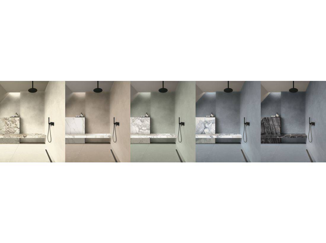
Color in the bathroom isn’t just an aesthetic choice: it can alter the perception of space, define a function, and change the overall style of the room.
Before choosing a shade, it’s helpful to ask yourself where you’ll use it and what effect you want to achieve.
A light color palette can make the space brighter and airier; a more intense color can make it appear deeper and more sophisticated; a warm shade can create a cozier atmosphere; while a cool shade can evoke a more contemporary and relaxing effect.
Pictured: Colovers+ and Purity of Marble. The color variations show how the same bathroom can change in perception and style.
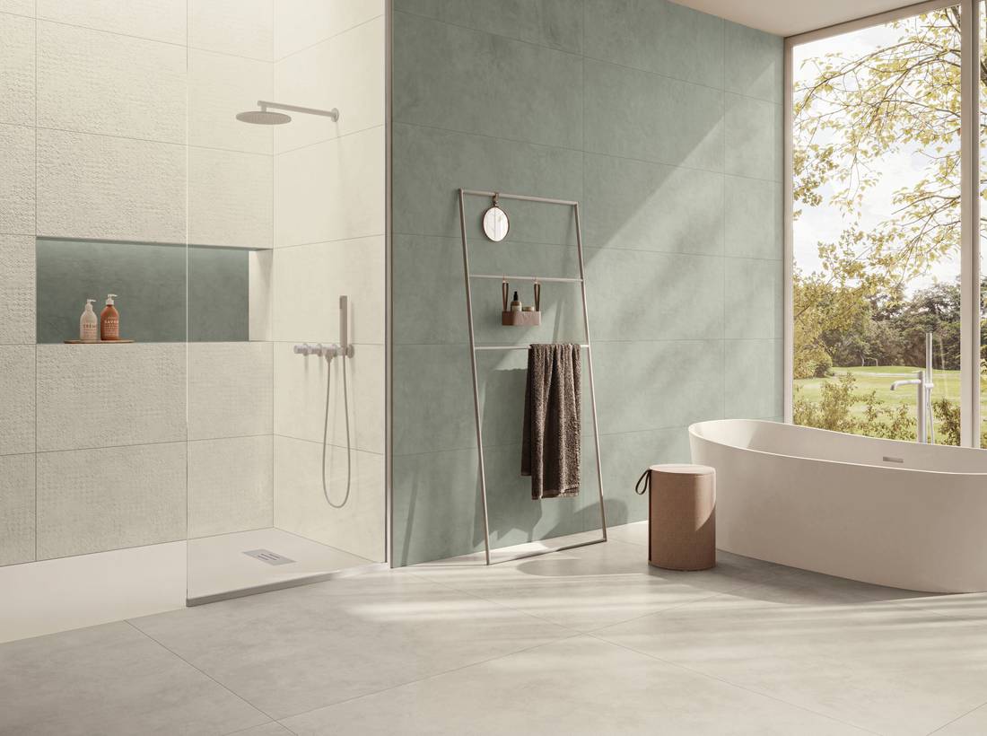
Color can also help organize the bathroom.
A darker wall can delineate a specific area—such as the bathtub area—while a wall covering in a different color can define the shower, and a niche can echo a shade already present in the design, creating a visual connection between different surfaces.
Pictured: COLOVERS+ Sage and Sand wall coverings.
The advice here is to follow a clear approach: work with tone-on-tone colors, create a specific contrast, or start with a neutral base and introduce a single, bolder accent.
Using too many shades with equal emphasis risks making the space less visually coherent, whereas a color used intentionally can give the bathroom its own identity without overwhelming it.
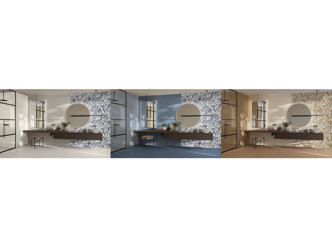
Color variations are useful precisely for this reason: they allow you to see how the same space can take on a different character depending on the chosen color palette. A light, blue, or warmer version not only changes the color of the walls but also the overall perception of the space.
In the photo: COLOVERS+, color variations. Different color schemes for the same space to show how the perception of the space and the bathroom’s style change.
Among Supergres’ solutions, COLOVERS+ allows you to use color as a design element, demonstrating how different shades can alter the perception of the bathroom and shape its style: more neutral, more contemporary, warmer, or bolder.
5. Combine textures and finishes to create rhythm without losing a sense of unity
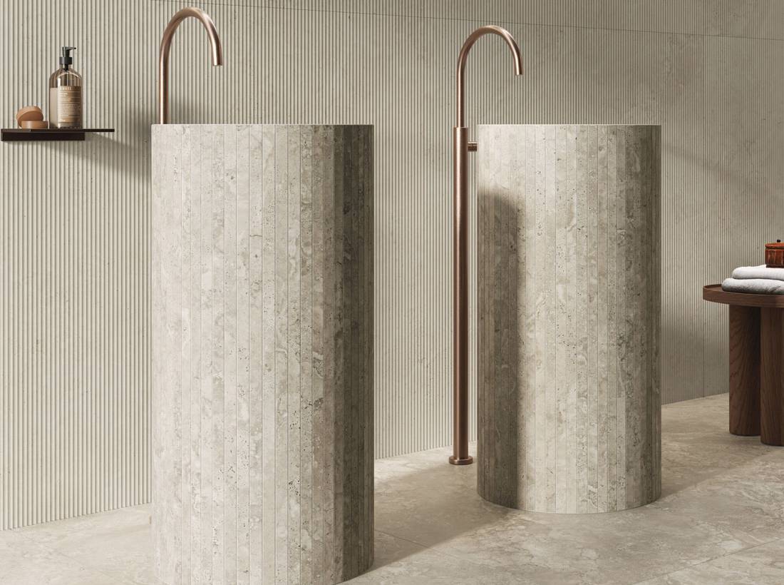
A bathroom doesn’t necessarily have to be designed with surfaces that are all the same: large slabs, mosaics, brick, 3D textures, and smooth, glossy, or matte surfaces can all coexist in the same space and make it more dynamic.
The key lies in how they are brought together, which requires a unifying element.
This could be color, material, a finish, or a shade that recurs across different surfaces.
A 3D texture can define the sink area while remaining tone-on-tone with the rest of the space.
Pictured: Kave Nut and Ivory.
.
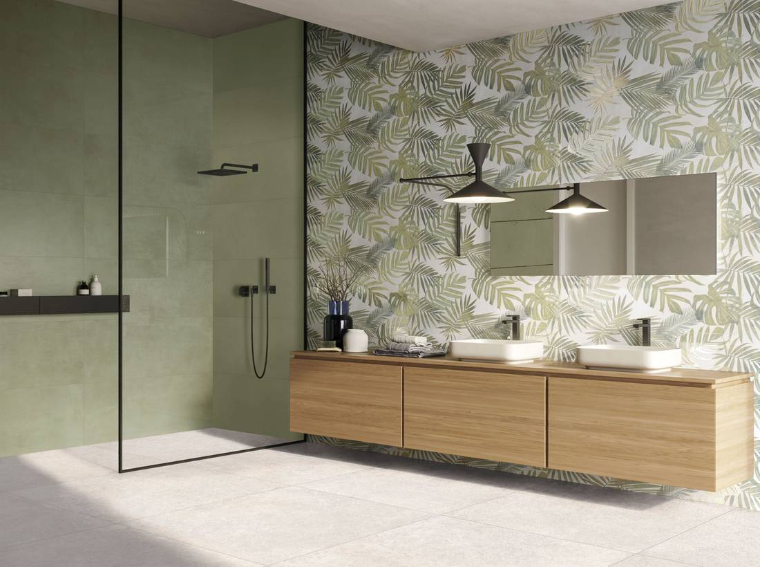
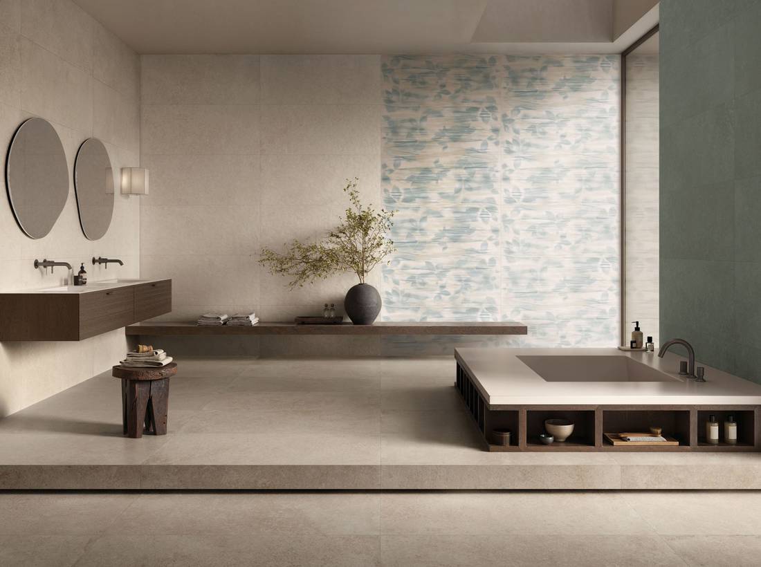
A pattern can complement a solid color when it incorporates one or more colors already present in the design.
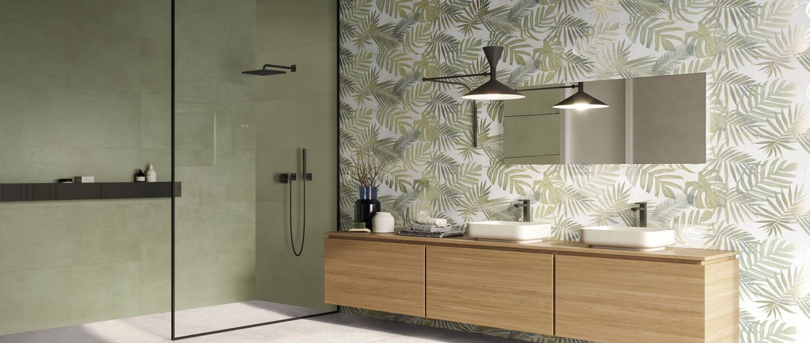
Pictured: Your Match Leaf and the Jungle pattern.
.
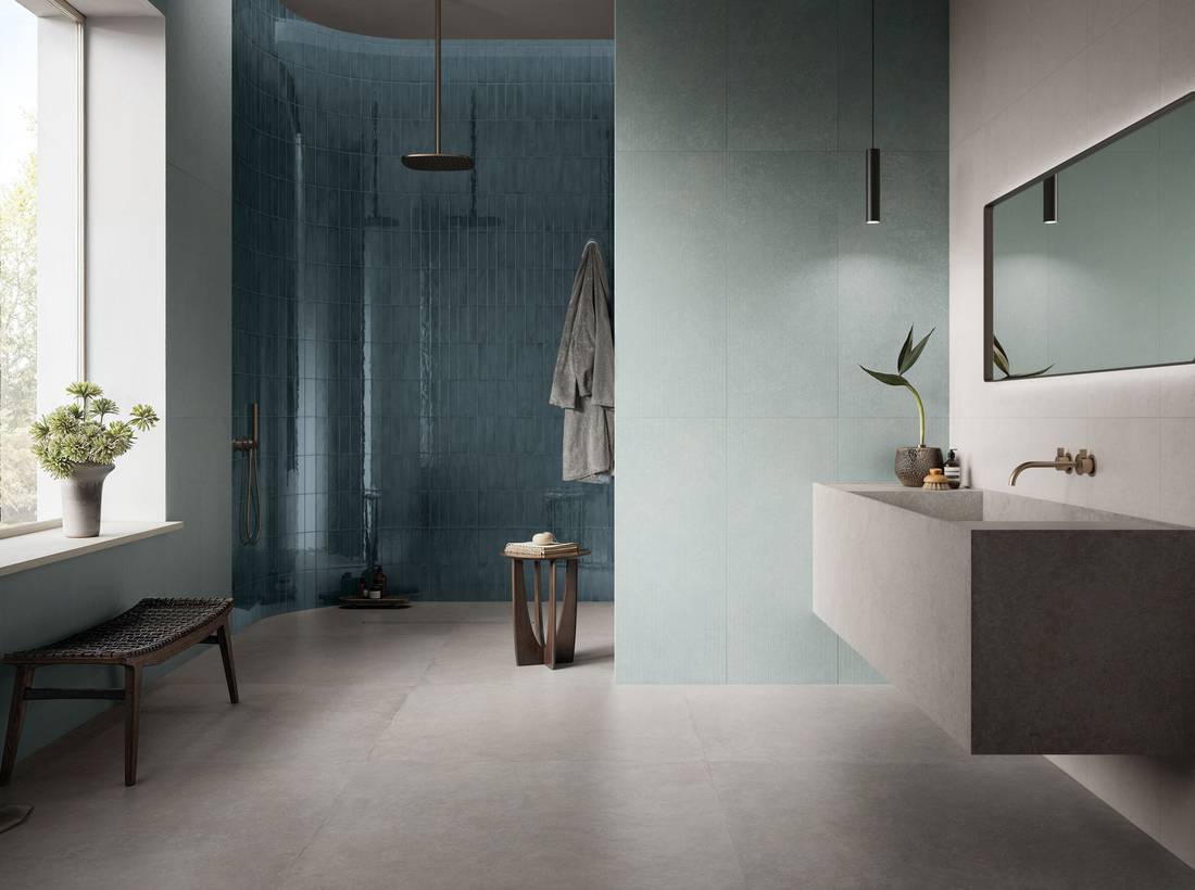
The finish also plays an important role: a matte surface creates a softer, more subtle effect; a three-dimensional texture creates shadows and depth, especially when it interacts with lighting; and a glossy surface reflects light, drawing attention to specific details.
As in this case, where the glossy brick enhances the shower by creating a contrast with the floor and wall tiles.
Pictured: Briksy Ocean, Inx Plume, and Aqua for the wall tiles, and Inx Pearl for the floor.
The advice is to vary the scale and finish, not to multiply the ideas. Choosing a few elements and linking them through a recognizable detail allows you to create movement without losing a sense of unity. In this way, textures, mosaics, and decorations are not merely decorative additions, but tools for creating rhythm and organizing the perception of space.
In this context, white body plays a particularly interesting role in interior wall tiles, as it allows for great creative freedom when working with color, patterns, three-dimensional surfaces, and wall details.
Among Supergres’ solutions, collections such as YOUR MATCH, COLOVERS+, INX, and BRICKSY allow you to combine color, decorations, brick effects, three-dimensional structures, and different finishes, creating more complex bathrooms without losing coherence.
6. Incorporate surfaces, volumes, and niches into the design
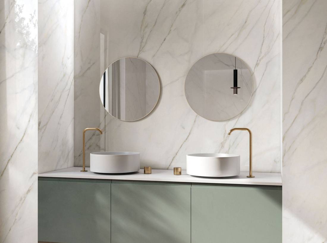
In a bathroom, surfaces aren’t necessarily limited to floors and walls.
More and more often, niches and freestanding elements—such as benches, sinks, tubs, shelves, or shower pans—are also incorporated into the design. This makes the bathroom feel like a more architectural and cohesive space, where each element complements the others.
A niche clad in the same material can enhance the sink area, making it more defined and recognizable.
Pictured: PURITY of MARBLE, Elite Eden. The sink area is set within a bright, continuous niche, where the marble-effect surface serves as an architectural frame for the space.
.
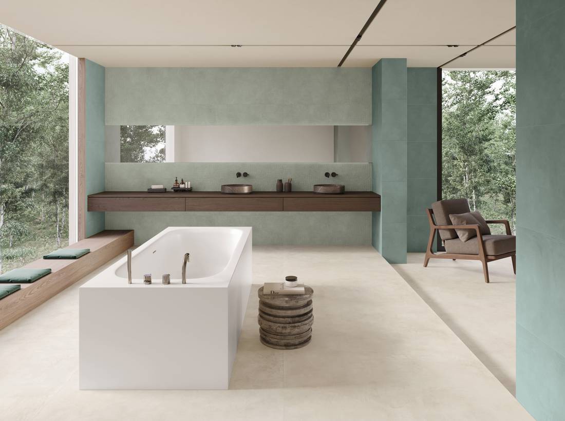
Similarly, a cabinet, a bench, a tub, or a countertop can interact with the main surfaces and reinforce the cohesion of the space.
Pictured: Colovers+ Love Jade and Love Sade.
Our advice is to think of tiles not just as a finish but as a tool for shaping the space—to create depth, frame a specific function, establish continuity, or give a bathroom element a more architectural feel.
Among Supergres’ solutions, large slabs and coordinating surfaces allow you to design walls, niches, and structural elements with strong visual continuity, minimizing disruptions and enhancing the project as a whole.
.
n conclusion, continuity, slabs, functions, focal point, color, texture, and finishes are not separate decisions. In the bathroom, every surface alters the perception of the whole.
There is therefore no single “right” solution.
A choice works when it makes sense within the actual space: it interacts with the light, enhances the proportions, complements the various functions, and contributes to the atmosphere we want to create.
Porcelain stoneware allows you to focus on continuity, durability, and a cohesive overall look.
Large slabs help create expansive, continuous surfaces with few grout lines and a strong visual impact. The white body offers creative possibilities for interior wall coverings, color, decorations, finishes, and three-dimensional textures.
These are different solutions that can be selected and combined based on the role each surface is meant to play in the project.
The best surface isn’t simply the one that makes the biggest impression; it’s the one that, when you walk into the bathroom, seems as though it was always meant for that space.
Discover the Supergres collections for bathroom floors and walls
 Look on the map