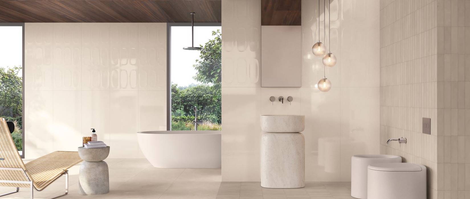
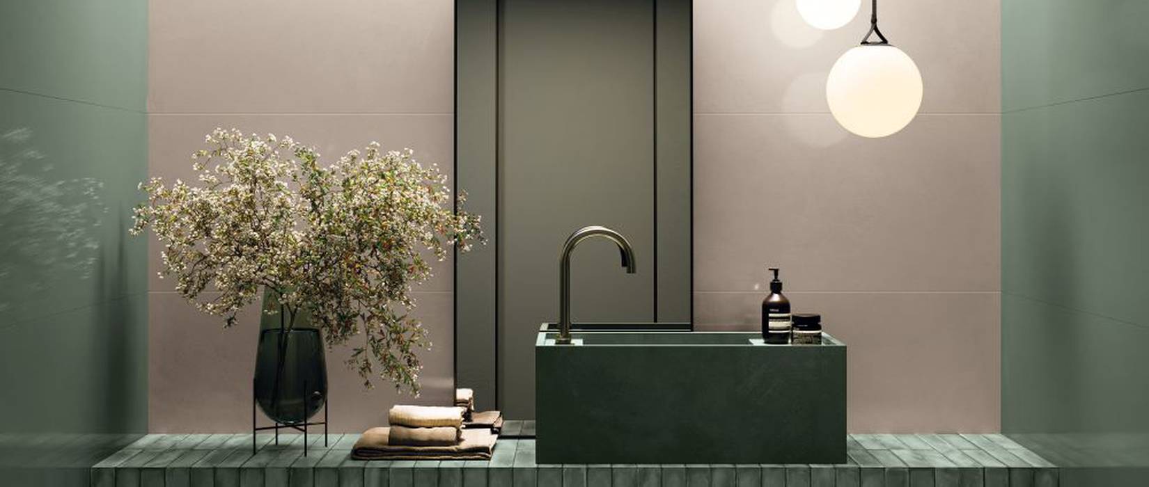
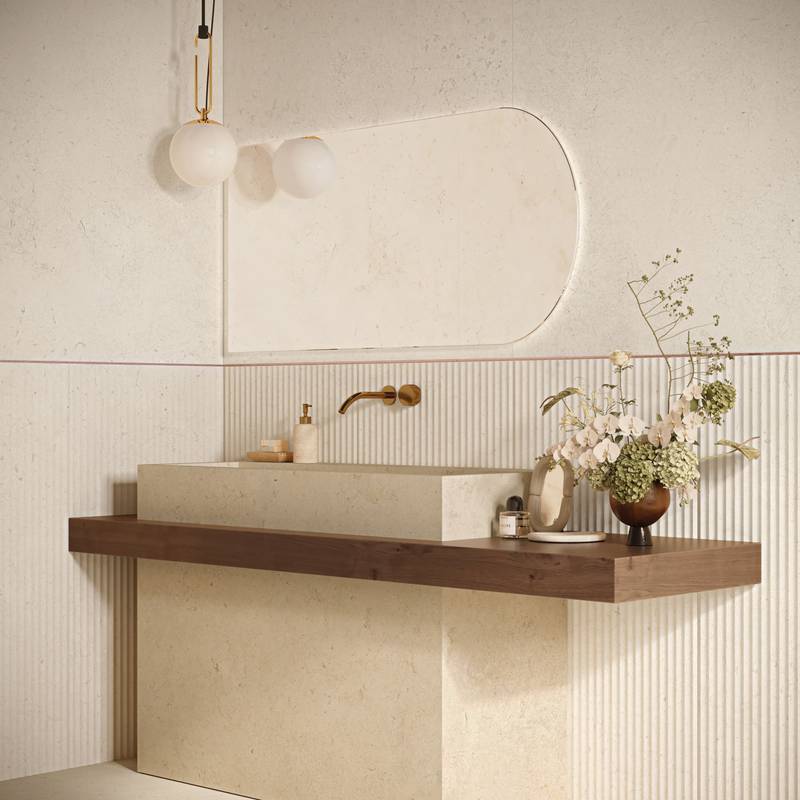
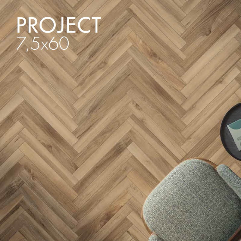
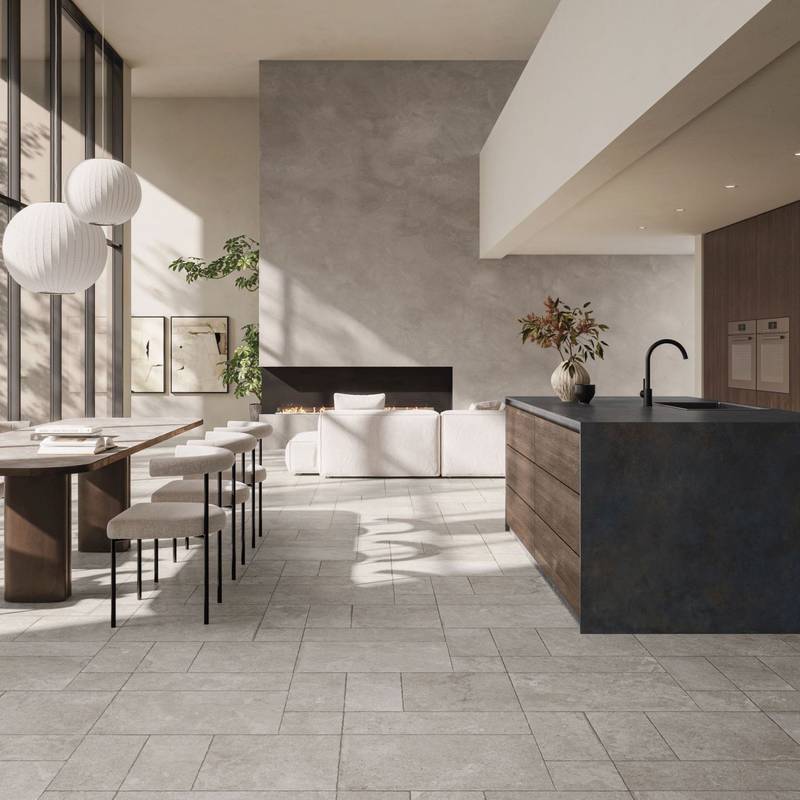
Wall Design Project redefines wall coverings through a coordinated system of colours, 3D textures, decors, and finishes: a design language integrating aesthetics, material depth, and sensorial appeal through 6 palettes, 60+ colours, natural or glossy surfaces, 3D structures, decors, and matching floor tiles. A flexible set of tools offering endless design possibilities.
In Wall Design Project, colour is an essential tool to direct light and shape atmospheres. The system organizes the range into 6 coordinated palettes to facilitate pairings and surface dialogue, turning every shade into a key element for designing distinctive, contemporary walls.
The 50x120 cm format is the heart of the collection:a wide, visually striking size conceived to combine maximum expressive freedom with complete modularity across the entire Supergres portfolio, making it easy to create seamless, elegant, and impactful walls.
Matt and glossy finishes alongside three-dimensional structures sculpt the light, adding tactile vibrations and dynamic contrasts that shape the identity of the space.
3D surfaces infuse walls with rhythm and depth through textures and geometries that interact with light. Wall Design Project provides ultimate versatility, allowing the glossy finish to be applied to 3D reliefs as well, enhancing any type of interior. Decoration is an integral component of the project: decors crafted with continuous pattern matching on every edge expand expressive potential and create scenic backdrops in seamless harmony with colours and textures.
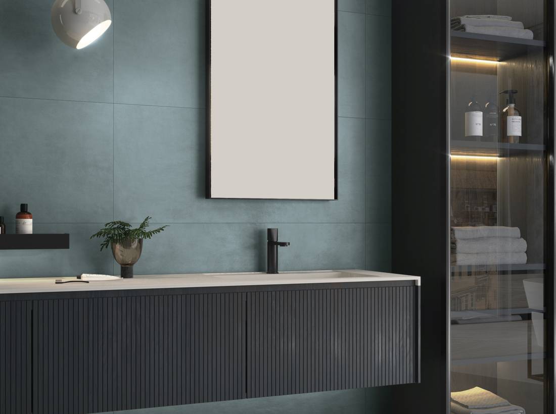
Shades of blue
convey a sense of calm, freshness,
and depth. From soft light blues to intense,
enveloping tones, these hues craft refined,
luminous, and dramatic atmospheres that
harmonise with any material. A versatile palette
where colour expands spatial perception
and carves out a distinctive identity.
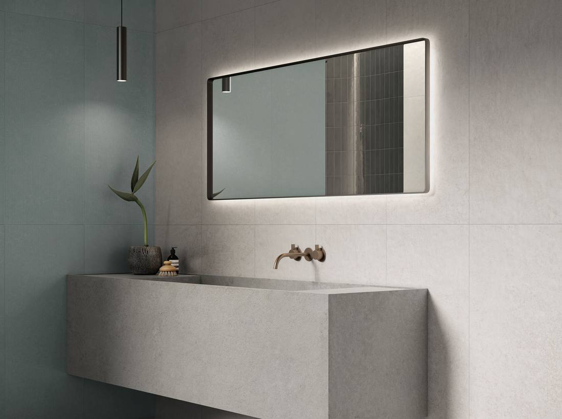
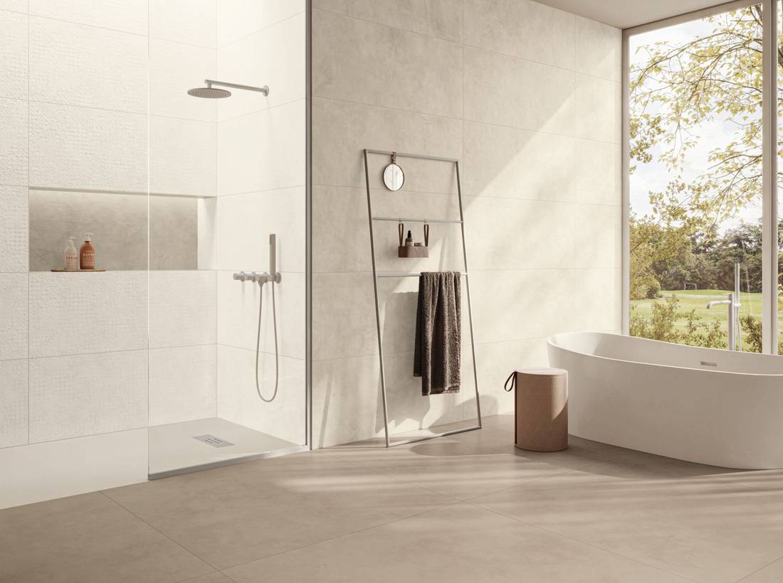
Neutral Cold
Cool neutrals interpret wall surfaces through a
luminous, architectural language. Whites, grays,
pearl, and mineral shades create airy surfaces that
capture light and visually expand interiors.
A palette designed for contemporary projects,
where chromatic minimalism serves as the
foundation for tone-on-tone blends, graphic
contrasts, or dialogues with concrete, stone,
marble, and metal looks.
Neutral Warm
Warm neutrals infuse walls with comfort, softness,
and material continuity. Beige, sand, cream,
warm greige, and ivory nuances shape inviting
spaces balanced between organic naturalness and
curated design. A cross-functional palette, perfect
for conversing with diverse finishes to achieve
harmonious, sophisticated interiors.
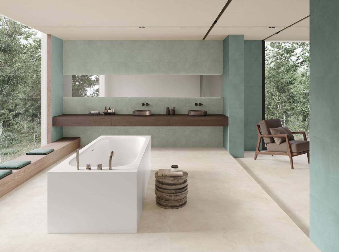
Green
Shades of green create an immediate connection
between the wall and nature, well-being, and
biophilic living. From sage green to rich mineral
shades, this palette conveys relaxing, sophisticated,
and contemporary settings. Combined with other
ceramic finishes, green emerges as a designforward
choice that transforms interiors into
balanced, serene sanctuaries.
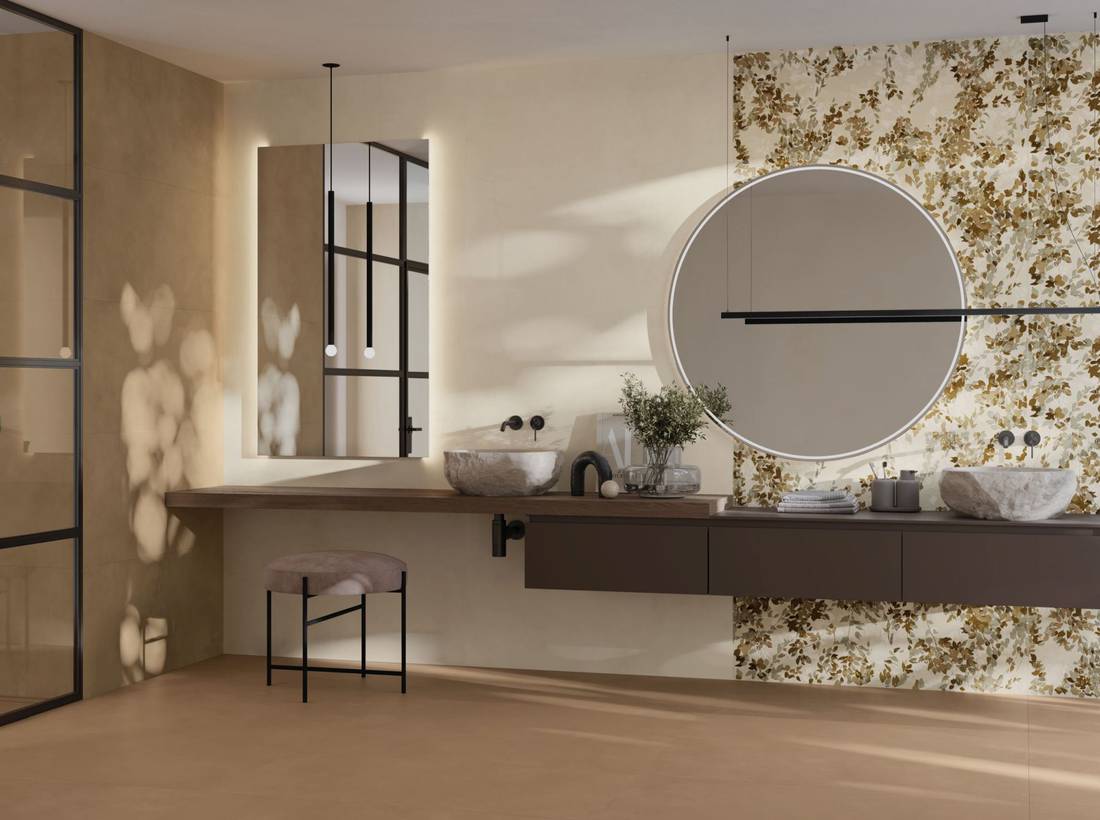
Earth
Earthy tones express warmth, substance, and the
depth of the natural world. Clay, terracotta, rich
sand, mud, rust, and burnt nuances lend walls
an opulent, welcoming presence that brings bold
character without losing balance. These shades
interact effortlessly with surrounding elements
and surfaces to shape environments rich in
sensory appeal.
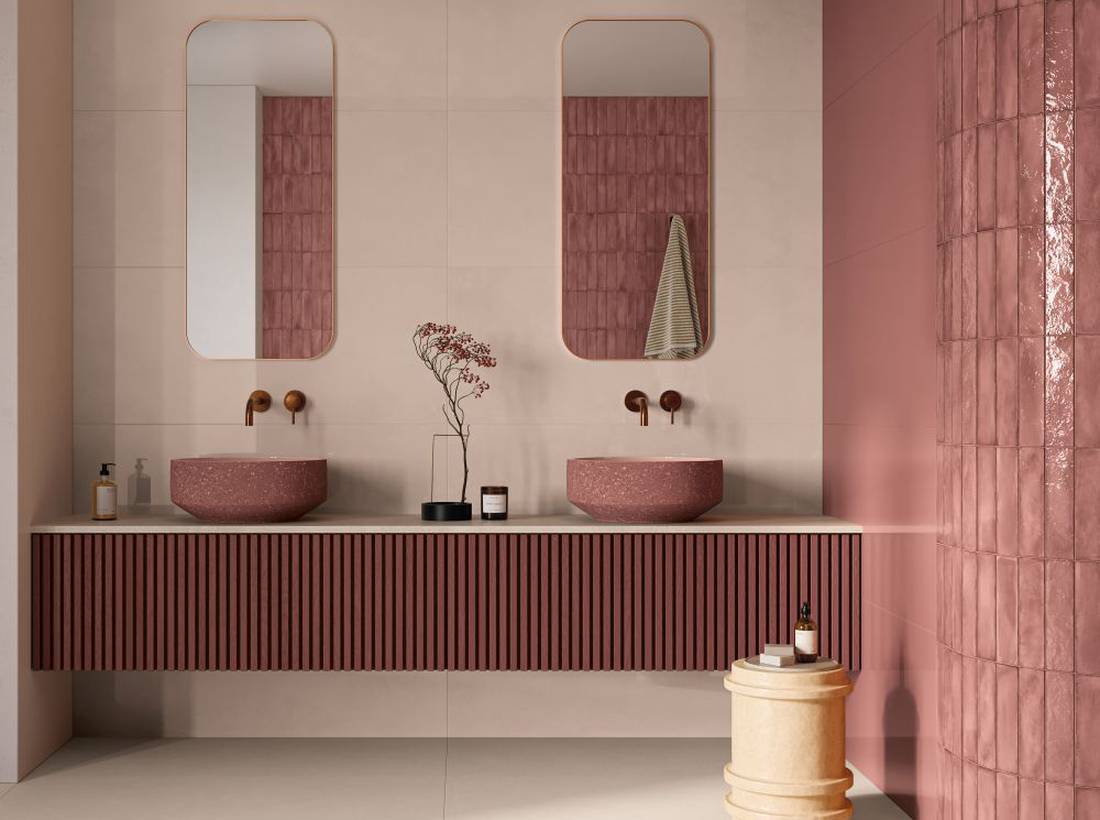
Red
Shades of red radiate intensity, warmth, and
expressive power. From soft blush pinks to brick,
ruby, and terracotta accents, this palette enables
the creation of focal points, theatrical backdrop
walls, and bold architectural features. Red serves
as an impactful design tool to impart depth, rhythm,
and distinct identity to both residential
and commercial spaces.
 Look on the map